

Images are usually the heaviest part of a web page, which makes them the fastest place to win back speed. A Singapore visitor on a busy MRT platform does not care how beautiful your photography is if it takes six seconds to appear. This guide walks through every step of image optimisation, from format and size to loading behaviour and alt text, in plain language your team can follow without a developer.
Fast images are not about making pictures look worse. They are about sending the right pixels, in the right format, at the right moment.
What image optimisation actually means
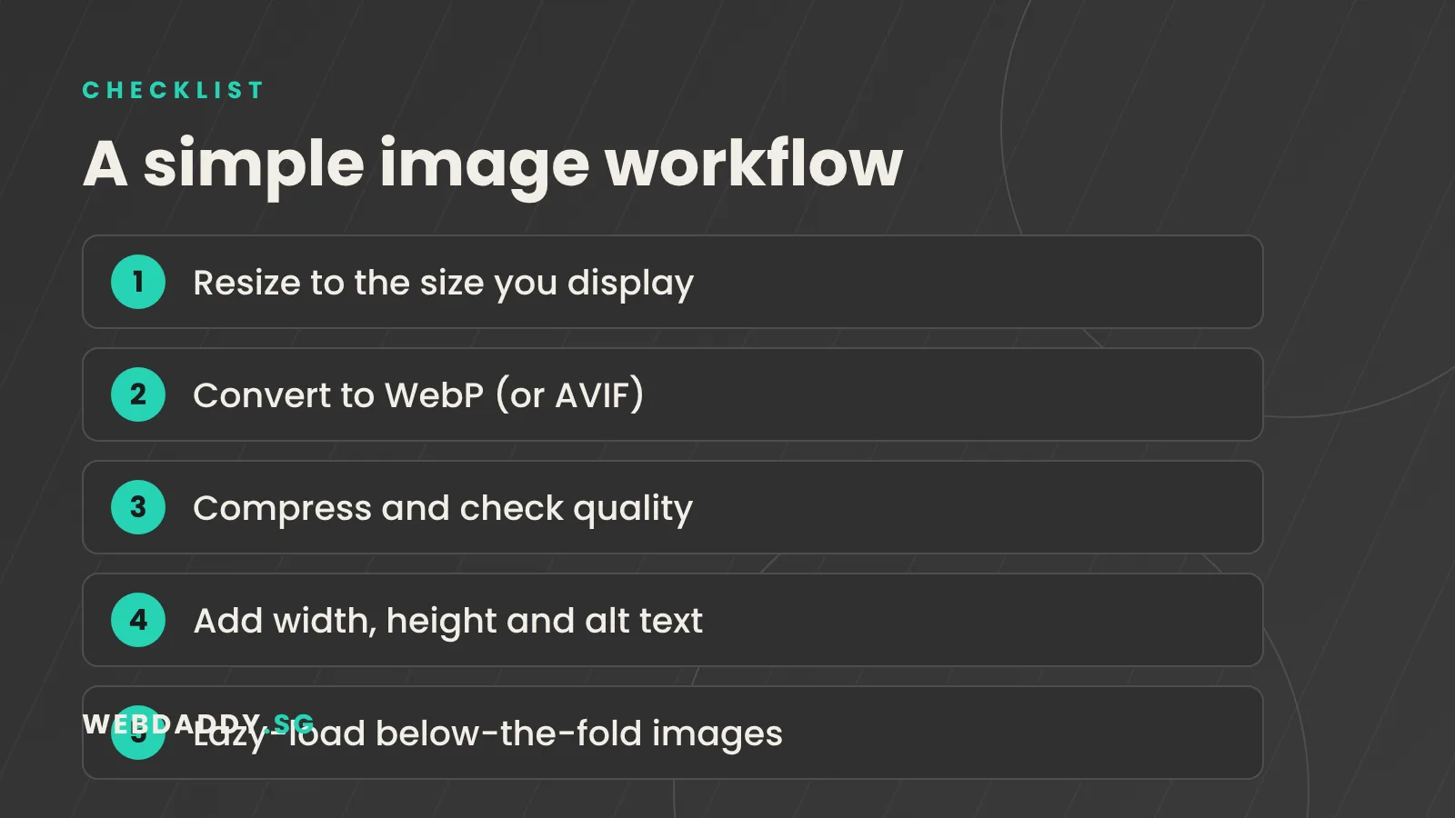
Image optimisation is the practice of delivering the smallest file that still looks good on the screen where it is viewed. It combines several habits: choosing a modern format, resizing the image to the dimensions it is displayed at, compressing it sensibly, telling the browser when and how to load it, and describing it for search engines and screen readers. None of these steps is difficult on its own. The value comes from doing all of them consistently, so every new blog post, product photo and banner follows the same routine before it is uploaded.
Why images decide your page speed
Large images slow the moment a visitor sees your main content, which Google measures as Largest Contentful Paint. A good score is 2.5 seconds or less. They also cause layout shifts when they load without reserved space, which affects Cumulative Layout Shift, where 0.1 or lower is considered good. For Singapore businesses, this matters on mobile data and in crowded places where signal fluctuates. Faster pages tend to keep more visitors, support better search visibility and make forms and checkout feel more trustworthy. If you only fix one performance problem this month, fix your images.
Choose the right format
Use the format that suits the content. JPEG is still fine for photographs when you cannot use anything newer. PNG suits graphics that need sharp edges or transparency, but the files can be heavy. SVG is ideal for logos and icons because it scales without losing quality and is usually tiny. WebP gives smaller files than JPEG and PNG at similar quality and is supported by modern browsers. AVIF can be smaller still, though encoding takes longer and tool support varies. A sensible default today is WebP for most images, with AVIF as an extra for large hero and product photos if your platform supports it. If you are unsure, export one important photo in two formats and compare them side by side at real size; the smaller file that still looks right to you is the winner for that kind of image.
Resize before you compress
A common mistake is uploading a 5,000-pixel photo straight from a camera or phone and letting the browser shrink it. The visitor still downloads every pixel. Work out the largest size an image is displayed at on your site, such as 1,200 pixels wide for a full-width content image, then export a version at that size, plus a second version at double the size if you want sharp results on high-density screens. Resizing alone often cuts file size dramatically before any compression is applied, and it is the single most effective step in the whole process.
Compress without ruining quality
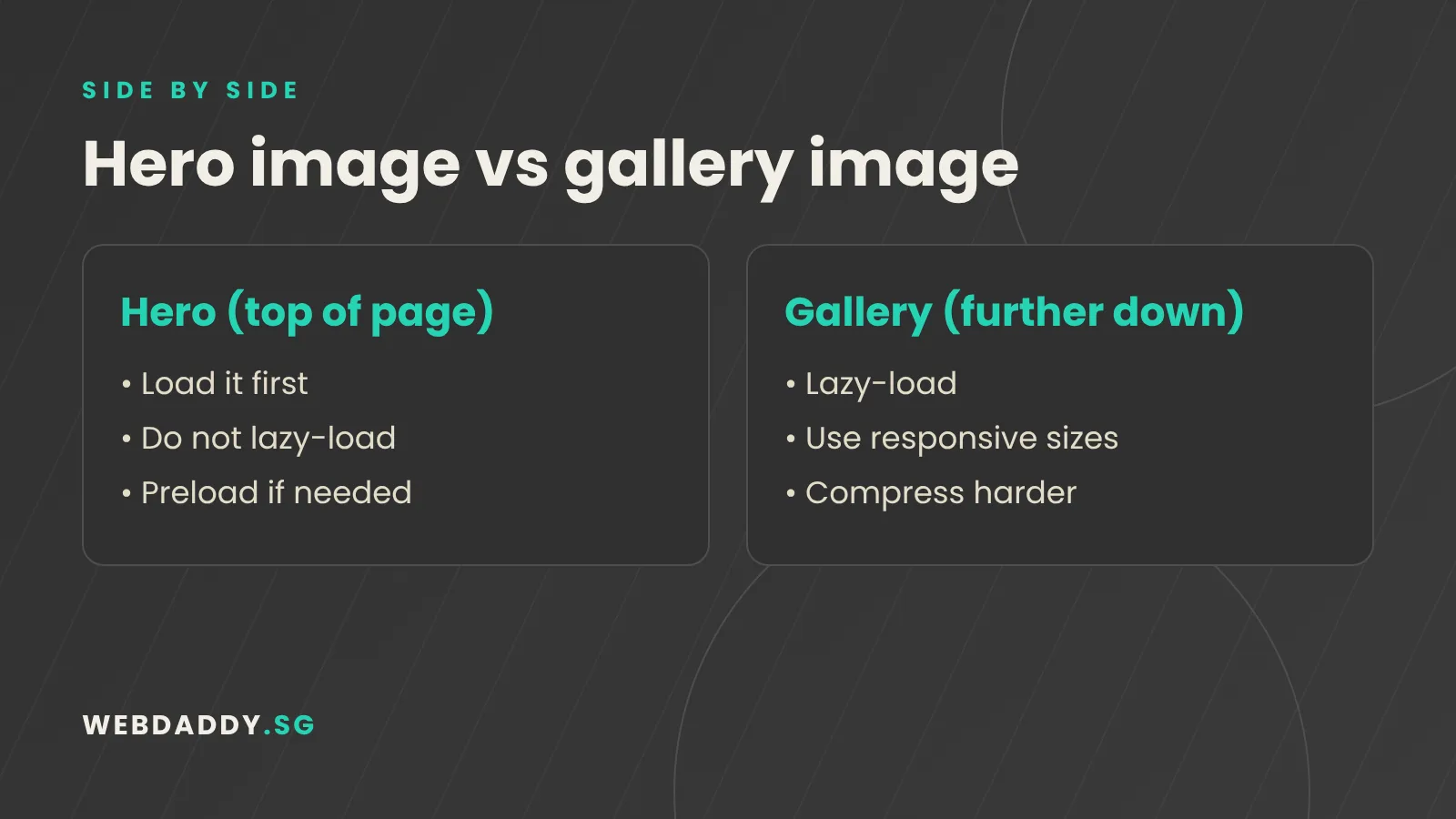
Compression removes data you will not notice. For photographs, a quality setting between about 70 and 85 usually looks identical to the eye while saving a lot of weight. As a rough rule of thumb, aim for most content images under about 200 KB and hero images under about 300 KB, then adjust for your own brand standards. Compare the original and the compressed version at actual size, not zoomed in. Use lossless settings for graphics with fine text, and be more aggressive for background images and thumbnails where detail matters less. Keep your original files safely archived in case you need to re-export later. Remember that screenshots and graphics with text compress differently from photographs, so test them separately instead of applying one setting to everything.
Serve responsive images with srcset and sizes
Different devices need different image sizes. A phone with a 390-pixel-wide screen should not download the same file as a 27-inch monitor. The srcset and sizes attributes let you list several versions of an image and tell the browser how wide the image will appear, so it picks the best one automatically. Many content management systems, including WordPress and Shopify, generate these versions for you, but only if your theme uses them correctly. Ask your developer to confirm that your key templates output responsive images, because it can reduce mobile data use significantly.
Lazy load below the fold, but not the hero
Lazy loading delays images until the visitor is about to scroll to them, which saves bandwidth and speeds up the initial load. Modern browsers support it with the loading attribute set to lazy. However, never lazy-load the main image at the top of the page. That image is usually your Largest Contentful Paint element, and delaying it makes the page feel slower. Instead, load it eagerly, and consider giving it high fetch priority so the browser fetches it first. Use lazy loading for galleries, long articles, product grids and anything far down the page.
Reserve space to prevent layout shifts
When an image loads without known dimensions, the content below it jumps down, which is annoying and can cause mis-taps on mobile. The fix is simple: include width and height attributes, or set an aspect ratio in your styles, so the browser reserves the right amount of space before the image arrives. This is especially important for banners, product photos and embedded media. A stable layout feels more professional, and it improves your Cumulative Layout Shift score without changing a single pixel of your design.
Write useful alt text and file names
Alt text describes an image for people who cannot see it and gives search engines context. Write a short, factual description, such as "Barista pouring a flat white at a Tiong Bahru cafe", rather than stuffing keywords. Leave it empty for purely decorative images so screen readers skip them. Use descriptive file names with hyphens, like tiong-bahru-cafe-flat-white.webp, instead of IMG_4821. These small details help accessibility, support image search, and make your media library much easier for your team to manage over time. Product images deserve the most care, because shoppers zoom in and compare details, so describe the colour, material and angle that matters to a buyer.
Use a CDN and smart caching for Singapore visitors
Even a well-optimised image takes time to travel. Hosting your site on servers in or near Singapore, or using a content delivery network with an Asia-Pacific presence, shortens the distance between your files and your visitors. Set long cache lifetimes on images so returning visitors do not download them again, and use versioned file names when you change an image so the new version appears immediately. Many platforms, including Shopify, serve images through a CDN by default, while WordPress sites often need a plugin or a hosting plan that includes one. If your audience is mostly in Singapore, test from a local connection as well as from overseas to confirm that the CDN is actually serving files from a nearby location.
Tools and plugins that make it easier
You do not need to be technical to start. Free tools such as Squoosh let you compare formats and quality in the browser. Desktop apps and command-line tools can batch-convert folders of photos. On WordPress, image optimisation plugins can convert uploads to WebP, resize them and compress them automatically. Shopify handles much of the delivery for you, but you still need to upload sensibly sized originals. Whatever tools you choose, document the routine, such as target width, quality setting and naming rule, so that anyone who uploads content follows it.
A monthly image audit checklist
Once a month, test your most important pages in Google PageSpeed Insights and note which images are flagged. Check the largest images on each page, confirm that the hero image is not lazy-loaded, look for missing width and height, and review any new uploads for size and alt text. Replace oversized banners, remove unused media and re-test. Keep a simple spreadsheet of scores over time so you can see whether changes are working. A fifteen-minute audit each month prevents the slow creep that makes websites heavier every year. Share the results with your team so that everyone understands why image habits matter, and celebrate improvements in your scores.
Get a faster website with Webdaddy
If your pages feel slow, we can find out why and fix it. Webdaddy builds fast, mobile-friendly sites with website design, keeps them healthy through website maintenance, and improves visibility with technical SEO. Message us on WhatsApp at +65 8083 8785, email support@webdaddy.sg, or request a free consultation and we will review your current page speed with you.
Call +65 8083 8785Email support@webdaddy.sg
Frequently asked questions
What is the best image format for websites?
For most images, WebP is a strong default because it is smaller than JPEG and PNG at similar quality and is widely supported. Use SVG for logos and icons, and consider AVIF for large photos if your tools support it.
How big should website images be?
As a rough guide, aim for content images under about 200 KB and hero images under about 300 KB, resized to the dimensions they display at. Your own quality standards and page weight targets may vary.
Should I lazy-load every image?
No. Lazy-load images below the fold, but load the main image at the top of the page eagerly because it usually determines how fast the page appears to load.
Can Webdaddy optimise the images on my existing site?
Yes. We audit your pages, compress and convert images, set up responsive delivery and caching, and re-test your speed scores so you can see the improvement.